
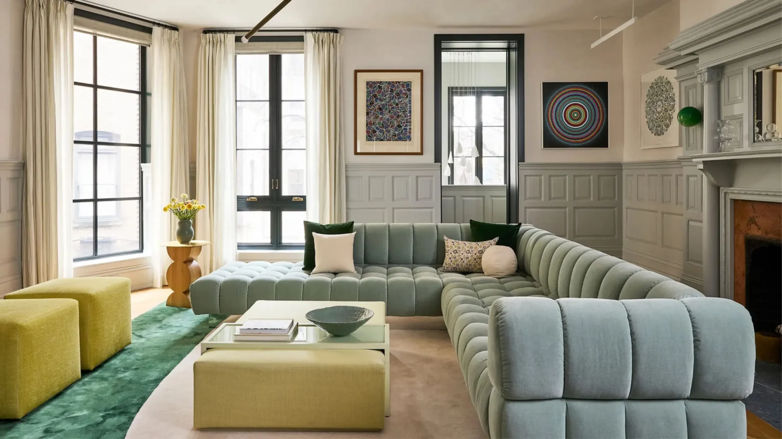
To choose furniture color according to wall paint, focus on balance and contrast: if your walls are light (white, cream, pastels), you can go for darker furniture like walnut, black, or deep grey to create contrast and make the room feel grounded; if your walls are dark or bold (navy, forest green, maroon), choose lighter furniture like beige, light wood, or off-white to avoid making the space feel heavy. For neutral walls, both warm tones (brown, oak, tan) and cool tones (grey, white, blue-based furniture) work depending on the mood you want. You can also use a “tone-on-tone” approach by matching warm walls with warm furniture or cool walls with cool furniture for a harmonious look, and always add small accent colors through cushions or décor to tie everything together.
Understanding Color Basics in Interior Design
Warm vs Cool Colors
Warm colors include shades like red, orange, and yellow, which create a cozy and energetic environment. These tones are often used in living rooms or dining spaces to make them feel more inviting. Cool colors like blue, green, and grey bring calmness and relaxation, making them ideal for bedrooms and offices. When pairing furniture, warm walls often go well with earthy or wooden furniture tones. Cool walls pair better with neutral or light-colored furniture. Understanding this balance helps you create emotional harmony in your space.
Neutral Colors
Neutral colors such as white, beige, grey, and black are highly flexible in interior design. They act as a base that allows furniture and décor to stand out without overwhelming the space. Neutral walls are perfect for experimenting with bold or colorful furniture pieces. They also help maintain a clean and timeless look that does not go out of style easily. Furniture in natural wood, black, or soft pastel shades works very well with neutral walls. This combination is widely used in modern homes.
Color Harmony Concepts
Color harmony refers to how different colors work together visually in a space. Complementary colors are opposite on the color wheel and create strong contrast, making furniture stand out. Analogous colors sit next to each other and create a smooth, calming effect. Monochromatic schemes use variations of one color for a very clean and elegant appearance. Using these principles helps avoid clashing colors in interiors. They guide you in choosing furniture that enhances rather than competes with wall paint.
Matching Furniture Colors with Wall Paint
White or Light-Colored Walls
White or light-colored walls create a bright and open environment, making rooms look larger. To balance this brightness, darker furniture such as walnut brown, black, or navy blue works very well. These contrasts add depth and sophistication to the space. Pastel-colored furniture can also be used for a soft and modern feel. Light walls give you freedom to experiment with bold statement pieces. Overall, this combination creates a clean yet stylish interior.
Dark-Colored Walls
Dark walls like deep blue, charcoal, or forest green create a dramatic and luxurious atmosphere. However, they need lighter furniture to prevent the room from feeling too heavy or closed. Beige, cream, white, and light wood furniture help balance the intensity. Metallic accents like gold or silver can add elegance and shine. This combination works especially well in spacious rooms with good lighting. It creates a bold and premium interior feel.
Grey Walls
Grey walls are extremely popular in modern interiors because they are neutral yet stylish. They pair well with a wide range of furniture colors, making them very versatile. Yellow or mustard furniture adds energy and contrast to grey tones. Teal and blue create a cool, modern aesthetic. Wooden furniture adds warmth and balance to the overall look. This flexibility makes grey a safe and trendy choice.
Beige or Earth-Tone Walls
Beige and earth-tone walls create a warm and natural environment in any room. They work beautifully with wooden furniture, especially in medium or dark brown shades. Cream and ivory furniture enhance softness and elegance. Olive green or rust-colored accents add depth and personality. These combinations are often used in traditional and cozy interiors. They give a calm and grounded feel to the space.
Bold Colored Walls
Bold wall colors like red, royal blue, or bright green need careful furniture selection. In most cases, neutral furniture works best to balance strong wall tones. Too many bold colors together can make the space visually overwhelming. Soft shades like white, grey, or beige help maintain harmony. You can also use matching accents in small amounts for consistency. This approach ensures a stylish yet controlled interior design.
Choosing Furniture Based on Room Type
Living Room
The living room is the central space of the home and should feel welcoming and balanced. Furniture colors should match wall tones while also reflecting comfort and style. Neutral or earthy furniture works best in most cases. Accent colors can be added through cushions or rugs. The goal is to create a space that is both functional and visually appealing. It should feel warm for guests and family alike.
Bedroom
Bedrooms require calm and relaxing color combinations. Soft tones like pastel, beige, and light wood furniture work best with gentle wall colors. Avoid overly bright or harsh combinations that disturb relaxation. Matching tones help create a peaceful sleep environment. Minimal contrast is usually preferred in bedroom design. The focus should be comfort and tranquility.
Kitchen/Dining Area
Kitchens and dining areas need clean and practical color choices. White, grey, and light wood furniture are commonly used with simple wall colors. These combinations create a hygienic and fresh look. Slight pops of color can be added through accessories or chairs. Durability and cleanliness matter more than bold design here. The overall look should be neat and functional.
Office Space
Office spaces should promote focus, productivity, and professionalism. Neutral or cool-toned walls paired with simple furniture work best. Colors like grey, white, and light wood reduce distractions. A clean and organized appearance improves concentration. Minimal design is preferred in most work environments. The goal is efficiency with a modern aesthetic.
Lighting and Its Effect on Color Selection
Natural Light Impact
Natural daylight is the most accurate source for viewing true colors in a room. It changes throughout the day, affecting how wall paint and furniture appear in the morning, afternoon, and evening. South-facing rooms usually look brighter, making colors appear more vibrant. North-facing rooms may look cooler and slightly darker. Because of this variation, furniture that looks perfect in a showroom may appear different at home. That is why testing colors under natural light is essential before final selection.
Artificial Lighting Impact
Artificial lighting can significantly change the appearance of both wall paint and furniture colors. Warm white lights make colors appear more yellow or cozy, while cool white lights create a sharper and more modern tone. LED, incandescent, and fluorescent lights all influence color perception differently. A beige sofa might look creamier under warm light but slightly grey under cool lighting. This makes lighting choice an important part of interior design planning. Proper lighting ensures your furniture and walls look consistent and attractive.
Color Distortion Issues
Poor or uneven lighting can distort colors and ruin the intended interior design effect. Shadows, dim corners, or overly bright spots can make furniture look mismatched with wall paint. Even high-quality furniture may appear dull or unattractive under bad lighting. This is a common mistake in many homes where lighting is not planned carefully. Balanced lighting helps maintain color accuracy and visual harmony. It ensures the space looks well-designed from every angle.
Testing in Different Conditions
It is always important to test furniture samples in multiple lighting conditions before finalizing a design. Check how the colors look during daytime, evening, and at night under artificial lights. This helps you understand how the furniture will actually appear in daily life. Small sample swatches or fabric pieces can be very useful for comparison. This step reduces the risk of wrong color choices. It ensures long-term satisfaction with your interior design.
Common Mistakes to Avoid
Overmatching Colors
One major mistake is choosing furniture that exactly matches wall paint, which can make the room look flat and lifeless. A lack of contrast reduces depth and visual interest. Instead, it is better to use complementary or slightly contrasting tones. This adds dimension and makes the space more dynamic. Balanced contrast creates a more professional interior look. Overmatching should be avoided in modern design.
Using Too Many Bold Colors
Another common mistake is combining too many strong or bold colors in one space. This creates visual chaos and makes the room feel overwhelming. Bold walls and bold furniture should rarely be used together. Instead, one element should stand out while others remain neutral. This helps maintain harmony and focus in the room. A controlled color palette always looks more elegant.
Ignoring Room Size and Space
Room size plays an important role in color selection, but many people ignore it. Dark furniture in small rooms can make the space feel even smaller. Similarly, too many light colors in large rooms can make them feel empty. Proper balance based on space size is essential for good design. Furniture color should always support spatial perception. This improves comfort and usability of the room.
Following Trends Blindly
Many people choose furniture colors based only on current trends without considering personal style or home environment. Trends change quickly, but furniture is a long-term investment. What looks stylish today may not suit your space tomorrow. Personal preference and comfort should always come first. A timeless design is more valuable than a trendy one. This ensures long-lasting satisfaction.
Ignoring Lighting Conditions
Poor lighting awareness is another serious mistake in interior design. Even the best furniture colors can look unattractive under bad lighting. Many people finalize choices without checking how lighting affects color appearance. This leads to disappointment after installation. Proper lighting planning is essential for accurate color matching. It ensures the design looks consistent at all times.
Pro Tips for a Balanced Interior Look
60-30-10 Color Rule
The 60-30-10 rule is a simple but powerful interior design principle. It suggests using 60% dominant color (walls), 30% secondary color (furniture), and 10% accent color (decor). This creates a well-balanced and visually appealing space. It prevents color overload and ensures proper distribution. Following this rule makes any room look professionally designed. It is widely used by interior designers.
Use of Texture Variety
Adding different textures helps enhance the visual depth of a room. Wood, fabric, glass, and metal can all be combined to create contrast even within similar color tones. For example, a wooden table with fabric chairs creates a balanced look. Texture variation prevents interiors from looking flat or boring. It adds richness without needing bold colors. This makes the design more sophisticated.
Decorative Balance Elements
Small decorative items like cushions, rugs, curtains, and artwork help tie the room together. These elements connect wall colors and furniture tones visually. They can also be used to introduce accent colors in a controlled way. Accessories are an easy way to update interior style without changing furniture. Proper use of décor enhances overall harmony. It completes the interior design story.
Importance of Sample Testing
Always test paint and furniture samples before making final decisions. This allows you to see real-life color interaction in your own space. It helps avoid costly mistakes and redesigns later. Samples should be viewed under different lighting conditions. This ensures better accuracy in selection. It is a simple step that improves results significantly.
Balancing Bold and Neutral Tones
A balanced mix of bold and neutral colors creates the best interior effect. Neutral tones provide stability, while bold colors add personality. Too much of either can disrupt harmony. Using them together ensures both comfort and style. This balance works well in all types of rooms. It creates a timeless and elegant interior look.
Why Choose Gourmet Furnishers
Premium Quality Furniture
Gourmet Furnishers is known for offering premium-quality furniture designed for long-term durability and comfort. Their products are carefully crafted using high-grade materials that ensure strength and elegance. Each piece is designed to meet modern interior needs while maintaining classic appeal. Quality control is maintained throughout the production process. This ensures customers receive reliable and lasting furniture. Their focus is on combining style with practicality.
Wide Range of Designs
They offer a diverse collection of furniture styles suitable for all types of interiors. Whether you prefer modern, minimalist, or traditional designs, options are available to match every wall color theme. This variety makes it easier to find the perfect furniture combination for your home. Customers can explore multiple design categories under one brand. It simplifies the decision-making process. This wide selection enhances customer satisfaction.
Expert Interior Guidance
Gourmet Furnishers also provides expert assistance to help customers choose the right furniture colors. Their guidance helps match furniture with wall paint for better visual harmony. This is especially helpful for people who are unsure about design combinations. Professional advice reduces the chances of design mistakes. It ensures a more polished and coordinated interior. This service adds extra value to the customer experience.
Comfort and Functionality Focus
Their furniture is not only stylish but also designed for everyday comfort and use. Ergonomic designs ensure better usability in living rooms, bedrooms, and offices. Functionality is considered alongside aesthetics during design development. This makes their furniture suitable for modern lifestyles. Comfort remains a top priority in every product. It ensures practical and enjoyable living spaces.
Suitable for Modern and Traditional Homes
Their collections are versatile enough to fit both modern apartments and traditional homes. Whether your walls are bold, neutral, or earthy, their furniture adapts well to different themes. This flexibility makes them a trusted choice for many homeowners. It allows easy coordination with various interior styles. Their designs help create balanced and attractive spaces. This adaptability makes them highly reliable in the furniture market.
Conclusion
Selecting the right furniture color according to wall paint is all about balance, contrast, and harmony. When done correctly, it transforms your space into a visually appealing and comfortable environment. Understanding color basics helps you avoid design mistakes and make confident decisions. Every room has different needs, so thoughtful planning is essential. Lighting and texture also play an important role in final results. With the right approach, you can create a home that feels both stylish and personal.
FAQs
What is the safest furniture color for any wall paint?
Neutral colors like white, beige, grey, and brown are the safest because they match almost all wall colors.
Can I use dark furniture with dark walls?
Yes, but only if the room has strong lighting and enough contrast through décor or flooring.
Which furniture colors make a room look bigger?
Light-colored furniture such as white, cream, and light wood makes rooms appear more spacious.
How do I match furniture with colorful walls?
Use neutral furniture to balance bold wall colors and avoid visual overload.
Is it better to match or contrast furniture with walls?
A balanced contrast is usually better, as it adds depth and makes interiors more visually interesting.
Leave a Reply
You must be logged in to post a comment.